Last updated: 2026-10-08

Simple format

Simple Marriage Biodata Format | Clean & Easy

A simple marriage biodata format is not a bare document. It is a format where the information hierarchy is stronger than the decoration. This is useful for families that want a straightforward profile that can be printed and forwarded easily.

Quick answer

Use five or six clear sections, short field values, one strong profile photo and a short About Me. Remove optional fields that are not relevant and keep the final document readable at normal phone zoom.

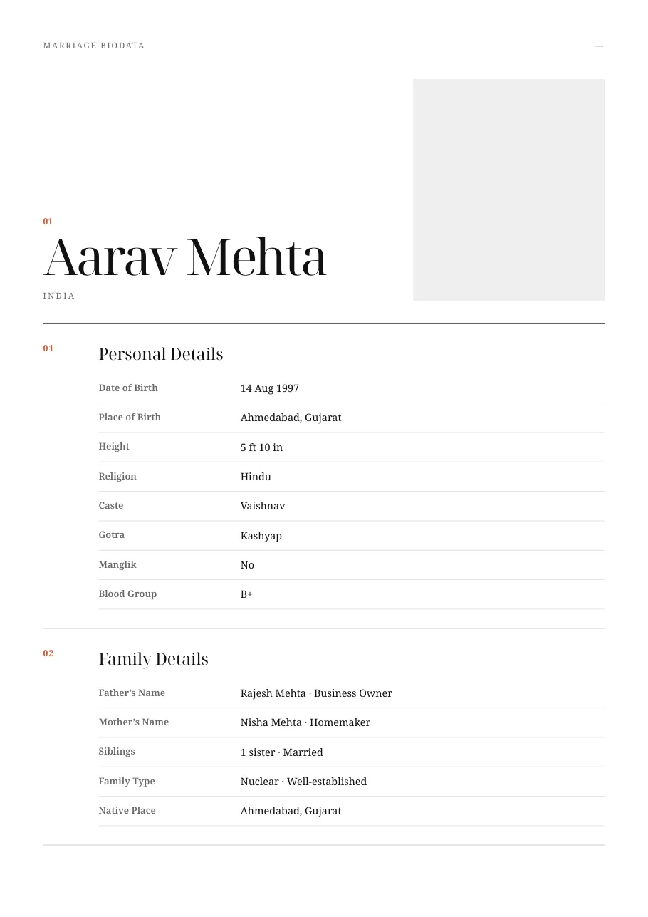
Editorial Mono simple marriage biodata template preview
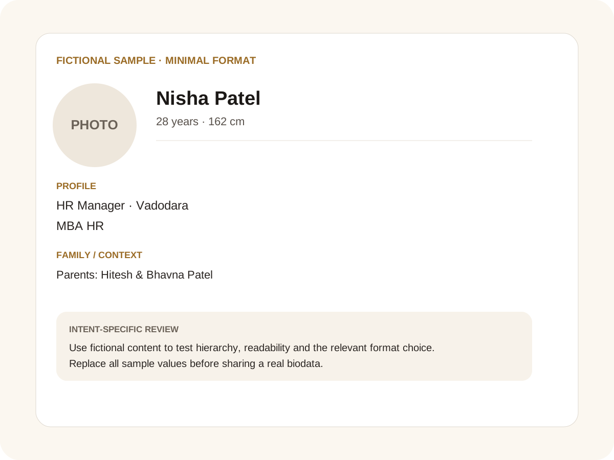
Fictional filled marriage biodata example for minimal format
Fictional sample for layout guidance. Replace every value with your own verified information.

Filled sample

What this example demonstrates

  • ✓ A five-section one-page profile
  • ✓ A simple profile for WhatsApp forwarding
  • ✓ A minimalist profile for a family introduction

Keep the information hierarchy strong

Personal, Family, Education & Career, About Me and Contact are enough for many profiles. Optional community or horoscope fields can be placed inside the relevant section rather than creating many tiny blocks.

Simple design also makes proofreading easier. If a date, city or name is wrong, it is easier to spot before the biodata is shared widely.

Simple does not mean generic

Use the About Me section to add two or three real details: a hobby, a work interest, a family value or the kind of life you enjoy. A small amount of specific writing can make a simple format feel personal.

For partner expectations, write what matters rather than a long list of requirements. “Open to relocation and looking for a respectful, family-oriented partner” is more useful than ten vague adjectives.

Best for fast sharing

Simple formats work particularly well when relatives forward them on WhatsApp. Keep the first page focused and move additional photos to separate pages. A PDF remains useful for printing, while a PNG is convenient for quick messaging.

If the family wants a Word document for later editing, use the DOCX export rather than copying text out of a screenshot.

Common mistakes for this intent

  • • Adding decorative blocks that defeat the simple layout
  • • Writing long paragraphs for basic facts
  • • Removing useful fields just to make the page shorter
  • • Using an unclear photo

Practical examples to compare

  1. 1. A five-section one-page profile
  2. 2. A simple profile for WhatsApp forwarding
  3. 3. A minimalist profile for a family introduction

How to use a minimal format example

A simple format succeeds by removing friction, not by removing meaning. The fictional example keeps the core facts visible and leaves decoration in the background. That distinction matters because families often forward a biodata through several phones before anyone prints it. A simple page should still answer who the person is, where they live, what they do, what their family context is and what kind of match they are open to. The sample is intentionally restrained so those decisions are easy to inspect.

For this intent, the sample facts are deliberately fictional: Nisha Patel is shown as the profile name, while the rest of the values establish a believable context without representing a real person. The example uses 28 years · 162 cm, HR Manager · Vadodara and MBA HR to show how personal, career and education information can sit together. The family line, “Parents: Hitesh & Bhavna Patel,” demonstrates the amount of context that can be supplied without turning the first page into a family directory. Replace every value with verified information before sharing.

Three situations this format can handle

Three practical ways to use this format are worth testing. First, a five-section one-page profile. Second, a simple profile for whatsapp forwarding. Third, a minimalist profile for a family introduction. These are different use cases rather than three versions of the same paragraph: one prioritises the information hierarchy, another changes the family context or audience, and the third tests how the design behaves when an optional requirement is introduced. Keeping those choices explicit makes it easier to explain why a particular template or field order was selected.

Review the finished minimal format profile

The most useful review is a content review followed by a rendering review. Check the facts, spelling, dates, relationships and location first. Then inspect the final page at the size at which a parent or prospective match will actually read it. For this page, pay particular attention to minimal format: it should be visible enough to answer the searcher’s question but should not overwhelm the rest of the profile. If a detail does not help a genuine first introduction, remove it rather than shrinking everything else.

A practical checklist

  • ✓ Five core sections
  • ✓ One clear profile photo
  • ✓ Short values and expectations
  • ✓ Only relevant optional fields
  • ✓ Readable A4 output
  • ✓ Safe contact details
Start a free biodata

Related biodata resources

Frequently asked questions

It is a concise profile with clear sections and minimal decoration. It should still include the information needed for a meaningful first introduction.