Last updated: 2026-10-08

Modern format

Modern Marriage Biodata Format | Clean Design

A modern biodata can respect traditional matrimonial expectations while presenting the information in a cleaner way. The goal is not to remove cultural fields; it is to make the document easier to understand and less crowded.

Quick answer

A modern marriage biodata usually combines structured facts, restrained design, a natural photo, a concise personal summary and optional traditional fields such as gotra or horoscope details. The user should be able to reorder or remove fields without rebuilding the profile.

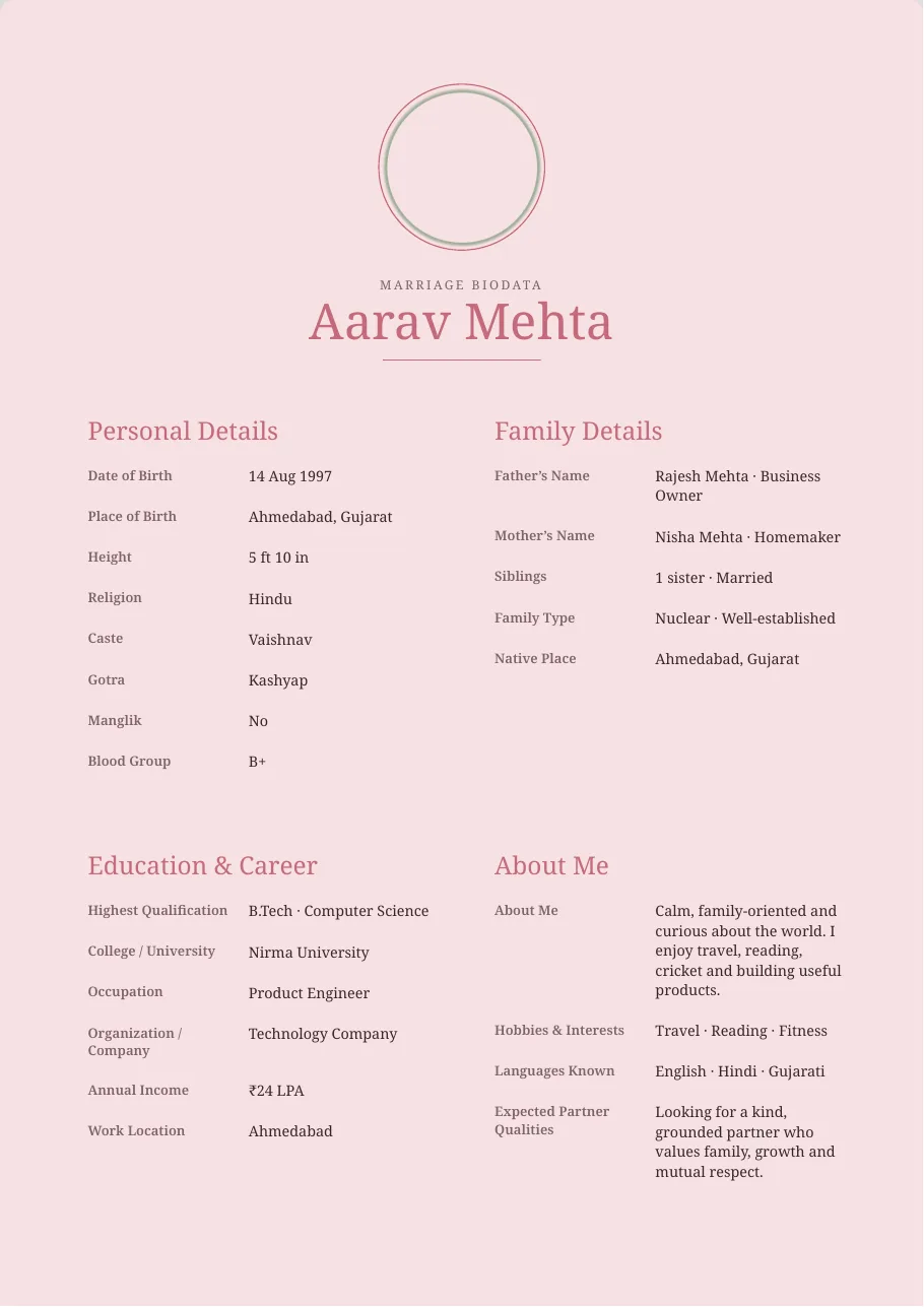
Blush Rose Floral modern marriage biodata template preview
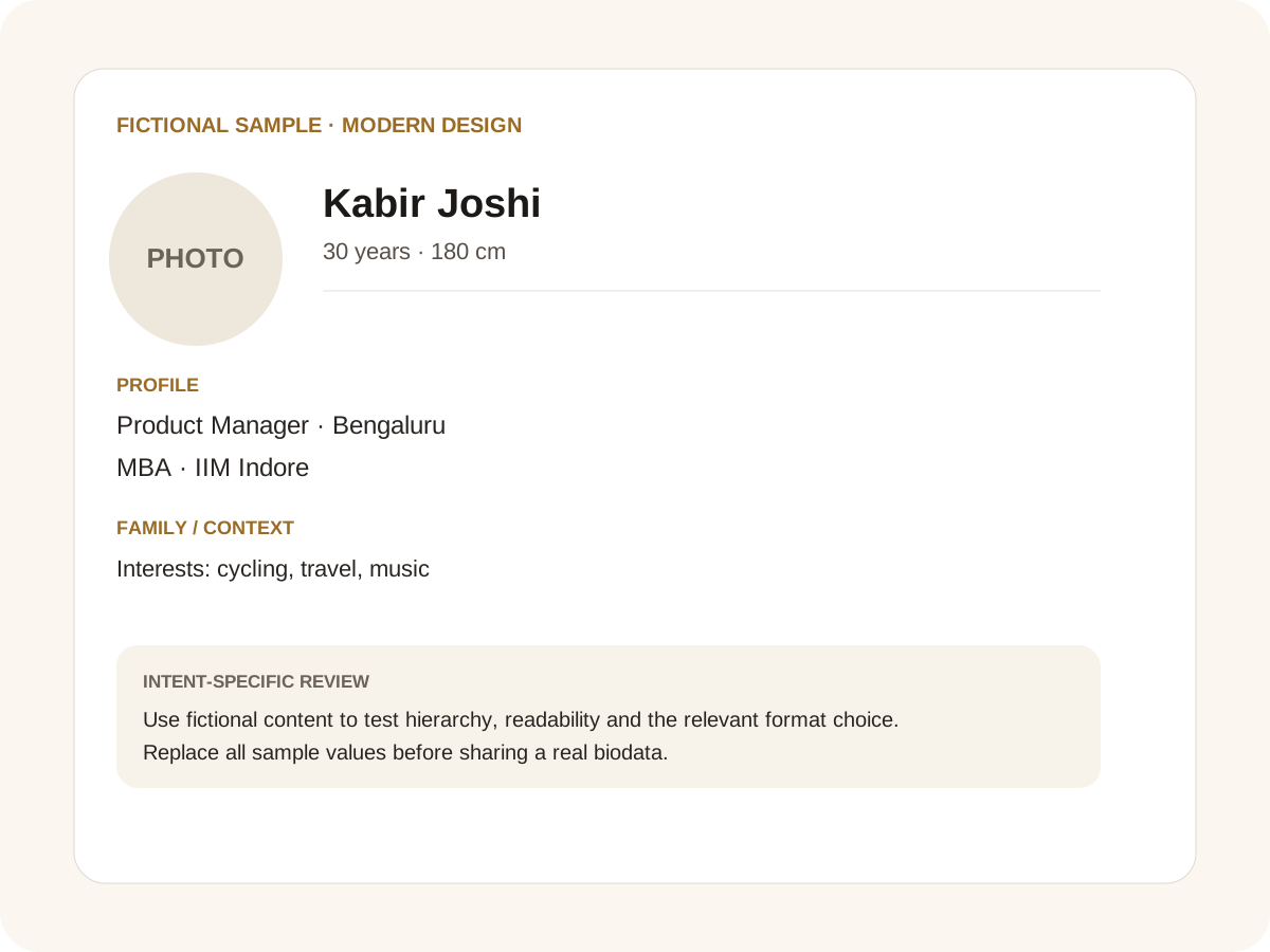
Fictional filled marriage biodata example for modern design
Fictional sample for layout guidance. Replace every value with your own verified information.

Filled sample

What this example demonstrates

  • ✓ A modern professional profile
  • ✓ A modern profile retaining gotra as an optional field
  • ✓ A modern profile with a short personality summary

Modern design is mostly about hierarchy

Use whitespace, consistent labels and short values. Avoid putting every detail in a decorative card. The reader should be able to find education, career and family information quickly.

Modern formats can still use Indian visual language: a subtle motif, a religious symbol selected by the user or a warm colour palette can create cultural context without overwhelming the page.

Let the person speak

The About Me section is one of the easiest places to make a biodata feel current. Mention interests, routines, values and what you enjoy about your work or family life. Avoid phrases such as “simple, sober, cultured” unless you explain what they mean for you.

Expectations should also be specific. Location flexibility, career plans, family involvement and lifestyle preferences are more informative than a long list of ideal traits.

Customisation without losing structure

The builder starts with predefined fields so users do not have to design a form from scratch. You can remove a field, move it up or down, or add a custom field when something unique matters to your family.

This approach works for modern profiles because the document stays consistent even after personalisation.

Common mistakes for this intent

  • • Confusing modern with overly decorative
  • • Using trendy labels instead of clear field names
  • • Hiding family context below too much design
  • • Over-editing the profile photo

Practical examples to compare

  1. 1. A modern professional profile
  2. 2. A modern profile retaining gotra as an optional field
  3. 3. A modern profile with a short personality summary

How to use a modern design example

Modern design is a communication choice, not a promise that traditional information is outdated. The fictional example uses a clean hierarchy while retaining room for details that may matter to an Indian family. The useful test is whether a parent can find the person’s education, career and family information without hunting through decorative cards. A modern page should also remain stable when a long Indian name, a regional-language value or a second-line expectation is entered.

For this intent, the sample facts are deliberately fictional: Kabir Joshi is shown as the profile name, while the rest of the values establish a believable context without representing a real person. The example uses 30 years · 180 cm, Product Manager · Bengaluru and MBA · IIM Indore to show how personal, career and education information can sit together. The family line, “Interests: cycling, travel, music,” demonstrates the amount of context that can be supplied without turning the first page into a family directory. Replace every value with verified information before sharing.

Three situations this format can handle

Three practical ways to use this format are worth testing. First, a modern professional profile. Second, a modern profile retaining gotra as an optional field. Third, a modern profile with a short personality summary. These are different use cases rather than three versions of the same paragraph: one prioritises the information hierarchy, another changes the family context or audience, and the third tests how the design behaves when an optional requirement is introduced. Keeping those choices explicit makes it easier to explain why a particular template or field order was selected.

Review the finished modern design profile

The most useful review is a content review followed by a rendering review. Check the facts, spelling, dates, relationships and location first. Then inspect the final page at the size at which a parent or prospective match will actually read it. For this page, pay particular attention to modern design: it should be visible enough to answer the searcher’s question but should not overwhelm the rest of the profile. If a detail does not help a genuine first introduction, remove it rather than shrinking everything else.

A practical checklist

  • ✓ Clean information hierarchy
  • ✓ User-selected religious/community symbol if desired
  • ✓ Optional traditional fields
  • ✓ Short personal summary
  • ✓ Reorderable fields
  • ✓ A4 PDF and editable Word output
Start a free biodata

Related biodata resources

Frequently asked questions

Yes. Modern presentation does not require removing traditional information. The fields can remain optional and user-controlled.