Last updated: 2026-10-08

One-page format

Single Page Marriage Biodata | A4 Format Guide

A single-page marriage biodata is ideal for first introductions when the profile can fit comfortably without tiny text. The key is editing the information, not simply shrinking the entire page.

Quick answer

Prioritise personal details, family, education and career, About Me, expectations and contact. Remove low-value fields and keep the profile photo prominent. If more photos are needed, put them on separate pages rather than shrinking the main biodata.

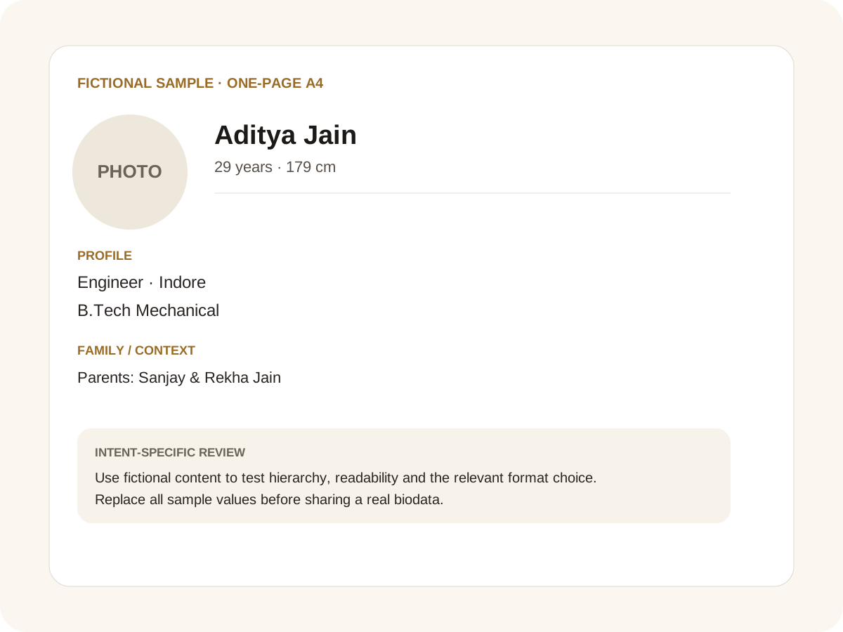
Fictional filled marriage biodata example for one-page A4
Fictional sample for layout guidance. Replace every value with your own verified information.

Filled sample

What this example demonstrates

  • ✓ A one-page professional profile
  • ✓ A one-page family-forwarded PDF
  • ✓ A one-page profile with optional horoscope fields

What to keep on page one

Keep the first page focused on information that helps a family decide whether to continue the conversation. Personal facts, family background, education, career and a short personal section normally fit when values are concise.

Use optional fields only when they matter. A one-page format is not a competition to include every possible field.

Design around real text

Long names, regional scripts and career descriptions can change the height of a row. Preview the actual data before exporting and make sure values wrap inside their containers.

If the content genuinely cannot fit without becoming hard to read, use a second page. A readable two-page document is better than a one-page document that requires zooming.

Separate photos when needed

The profile photo can stay on page one. Additional photos can be placed on dedicated pages or collected on one gallery page. This gives families a clean way to share more images without damaging the main layout.

For WhatsApp, the page-by-page image export can be more useful than sending a tiny contact sheet.

Common mistakes for this intent

  • • Shrinking the font below comfortable reading size
  • • Keeping too many paragraphs
  • • Using multiple photos on the main page
  • • Ignoring page overflow in the final export

Practical examples to compare

  1. 1. A one-page professional profile
  2. 2. A one-page family-forwarded PDF
  3. 3. A one-page profile with optional horoscope fields

How to use a one-page A4 example

One-page biodata is a layout constraint, so every line has to earn its place. The fictional example is designed around the first-introduction questions: identity, appearance, education, work, family, personality and expectations. The goal is not to fit everything at any cost. If a paragraph becomes too small or a photo forces important facts below the fold, the document has failed its one-page purpose. A disciplined one-page profile uses concise values and removes repetition before reducing font size.

For this intent, the sample facts are deliberately fictional: Aditya Jain is shown as the profile name, while the rest of the values establish a believable context without representing a real person. The example uses 29 years · 179 cm, Engineer · Indore and B.Tech Mechanical to show how personal, career and education information can sit together. The family line, “Parents: Sanjay & Rekha Jain,” demonstrates the amount of context that can be supplied without turning the first page into a family directory. Replace every value with verified information before sharing.

Three situations this format can handle

Three practical ways to use this format are worth testing. First, a one-page professional profile. Second, a one-page family-forwarded pdf. Third, a one-page profile with optional horoscope fields. These are different use cases rather than three versions of the same paragraph: one prioritises the information hierarchy, another changes the family context or audience, and the third tests how the design behaves when an optional requirement is introduced. Keeping those choices explicit makes it easier to explain why a particular template or field order was selected.

Review the finished one-page A4 profile

The most useful review is a content review followed by a rendering review. Check the facts, spelling, dates, relationships and location first. Then inspect the final page at the size at which a parent or prospective match will actually read it. For this page, pay particular attention to one-page A4: it should be visible enough to answer the searcher’s question but should not overwhelm the rest of the profile. If a detail does not help a genuine first introduction, remove it rather than shrinking everything else.

A practical checklist

  • ✓ A4 portrait
  • ✓ Concise values
  • ✓ Profile photo on page one
  • ✓ Optional fields removed when unnecessary
  • ✓ Readable regional scripts
  • ✓ Separate additional-photo pages
Start a free biodata

Related biodata resources

Frequently asked questions

Many can, but not all. The right choice is to keep the text readable and use a second page when the content genuinely needs more room.